New! Realtime Charts in Revolution
All about the new chartsEngine, with sample code and video
Are you working a lot with data in Revolution? Revolution is excellent for working with data, as we know. What do you do to display it?
Perhaps you display it in text fields. You may even have rolled your own solution to display a basic chart in a stack. We love Revolution's flexibility and power to let you do this, but unless charting is the main focus of your solution, it probably could be faster and prettier. It takes time to craft a great charting tool ... and finally, one is available.
I'll bet you've wished for something generic, that finds the right compromise between speed and aesthetics. We did. We had clients asking for charts in their apps, so we started experimenting with what we could do in Revolution. Some of those charts were static, so our artists started out with an Excel chart. Those weren't too pretty, but that's what Photoshop is for, right?
This approach became impractical as soon as we hit a chart that needed to draw more than 32,000 data points. We started experimenting with how to roll something cool in Rev. Our initial attempts were able to draw quite nice charts, but they were way too slow. We discussed this with Wouter Abraham on chatRev and brilliant mind that he is, he pointed us in a direction that allowed the line chart to draw in a fraction of the time that was needed in the iteration before his tweaks. Woot! Thank you man. That we succeeded in speeding up the library, even with millions of data points, is confirmed by this testimonial we have received from an early and very happy customer.
Polishing it up
Now we basically had the library we would wish to use internally. Ready to share it with other developers? Not yet. It is one thing to use something for yourself, but quite another kettle of fish to produce something other developers can use. The biggest problem was explaining how it works. We had seen a request for charting on the use list, so we thought it was a good time to post a "silent" request for interested testers there. Thanks to all of you who responded, especially Sarah, Jb, Jerry and Graham. You really helped us polish the library! Having a small base of interested developers was extremly helpful, as we discovered things that we considered to be the coolest thing since sliced bread were counterintuitive, needed to be tweaked or simply made no sense. With those kinks ironed out (and one of them was major, you bet!) we are pretty proud of what chartsEngine has become. Let me introduce you to it...
How it works
ChartsEngine is a powerful, yet lightweight library to create charts in a Revolution stack. It has been optimized to render data on the fly at high speed. It will extend Revolution's messagepath and makes its scripts available in any location in your Revolution application. It requires Revolution 3.0 or higher. You can download the free trial here and follow along with this example.
To use it, make sure it is loaded into memory. Open the messagebox and type:
start using stack "chartsengine"
In the IDE you also can double click the chartsEngine stack to start using it.
The following chartTypes are available:
- Lines
- LinesStacked
- Bars
- BarsStacked
- Pie
- Doughnut
chartsEngine relies on setting properties for your charts. Most of these properties are set to sensible pre-defined values properties. If you do not explicitly set them, chartsEngine defaults to settings that work well. Data is organized in return-delimited lists of items. The default itemDelimiter is comma. The default chart type is lines. This type lets you handle large amounts of data, while rendering very fast. Which chart type is best used in your projects depends on the data you want to display. While the line and bar types are not limited in the amount of data they can process, the pie and doughnut charts are limited to 300 entries per "ring" Not every dataset makes sense for every type of chart. The linesStacked type expects all values to be positive numbers, or the output might look strange.
Creating a chart
chartsEngine creates charts by Revolution script.
chartsCreateChart "nameOfChart"
will create a group with the name "nameOfChart" for you. The result contains a reference to the group that you can store in a variable for later reuse. Now you can set a few custom properties for this group to render the chart inside of that group. These properties are organized in the custom property set "charts" of the group that has been created. The most common custom property you will set is the charts["data"] of the group.
To finally render the chart you send the command chartsRefreshChart to the group, or use chartsRefresh as a command with an additional parameter containing a reference to the group.
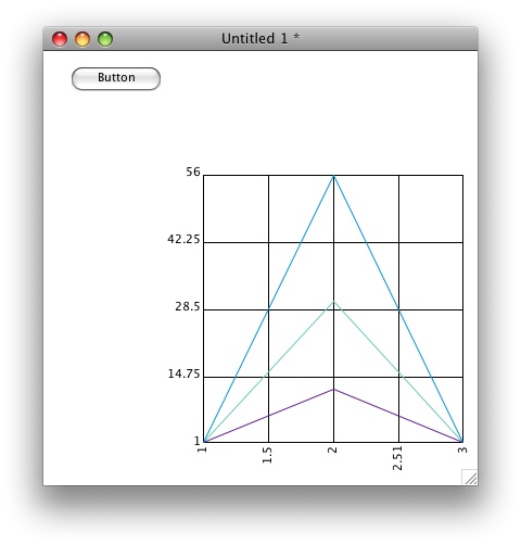
A complete script to create a chart can look like this:
on mouseUp
   local tchart
   chartsCreateChart
   put the result into tchart
   set the charts["data"] of tchart to "1,1,1" & cr & \
   "30,56,12" & cr & "1,1,1"
   chartsRefresh tChart
end mouseUp
This is what the output of this script looks like:
The chartsCreateChart command takes additional Parameters. You can specify the name of the group being created and the rectangle the chart should be drawn in. Possible uses are:
chartsCreateChart "myChart"
chartsCreateChart "myChart", the rectangle of this card
chartsCreateChart "myChart", tLeft,tTop,tRight,tBottom
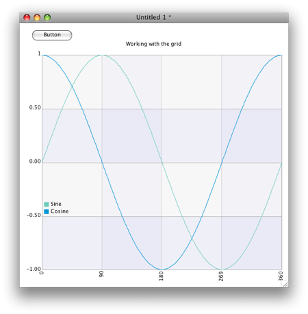
The appearance of the chart is governed by the setting of custom properties of the group the chart lives in. This allows you to script a chart the way you are used to from setting properties of other standard controls in Revolution. The easiest way is to use array notation to set these properties as you have seen in the example script above. Here is an example of how to draw a sine and cosine curve on a beautiful grid:
Create a new stack with a button in the top left corner, then add this script to it:
--> all handlers

on mouseUp
   local tchart -- holds a reference to the group being created
   local tLinesOfData,tTimeDuration
   local tData
   -- set up the data
   repeat with i=0 to 360
      put i,sin(i*pi/180),cos(i*pi/180)&cr after tData
   end repeat
   put the millisecs into tTimeDuration
   lock screen
   if exists(group "myChart") then
      put the long name of group "myChart" into tChart
      set the rect of tChart to the left of this cd,the top of this \
      cd +20, the bottomright of this cd
   else
      chartsCreateChart "myChart",the left of this cd,the top of this \
      cd +20, the bottomright of this cd
      put the result into tChart
   end if
   set the layer of me to the number of layers
   -- set the chart style
   set the charts["chartStyle"] of tChart to "lines"
   -- Take n lines of data as specified by the thumbpos of the
   -- scrollbar
   set the charts["data"] of tchart to tData
   set the charts["dataIncludesX"] of tChart to true
   -- number formats
   set the charts["gridXNumberFormat"] of tChart to "#"
   set the charts["gridYNumberFormat"] of tChart to "#.00"
   -- set legendproperties and show the legend
   set the charts["legendNames"] of tchart to "Sine" & cr & "Cosine"
   set the charts["showLegend"] of tchart to true
   -- The headline of the chart
   set the charts["caption"] of tchart to "Working with the grid"
   -- The grid settings
   -- -- draw n lines for x and y grid
   set the charts["gridx"] of tChart to 3
   set the charts["gridy"] of tChart to 3
   -- -- Show labels
   set the charts["showGridXDescription"] of tchart to true
   set the charts["showGridYDescription"] of tchart to true
   -- -- Grid color
   set the charts["gridColor"] of tchart to "dark gray"
   -- -- alternating rows and columns
   set the charts["gridXFillColor"] of tChart to 240,240,240
   set the charts["gridXFillAltColor"] of tChart to 230,230,240
   set the charts["gridyFillColor"] of tChart to "white"
   set the charts["gridYFillAltColor"] of tChart to "#eeeeff"
   -- -- -- Blending needed to show all alternates
   set the charts["gridYInk"] of tChart to "blend"
   -- linesize for the lines
   set the charts["lineSizes"] of tChart to 2
   -- force chart to redraw
   send "chartsRefresh" to tchart
   set the botleft of the chartsLegendId of tchart to the botleft \
   of grc "charts_gridy" of grp "myChart"
   unlock screen
   answer "It took "& the milliseconds - tTimeDuration&" \
   milliseconds to render the chart"
end mouseUp
Here's what this script will output:
What else can I do?
What else is in chartsEngine? It allows you to work with your data in a flexible way. It can scale for missing values, if you include the x-axis in the data. It lets you set many properties that allow fine control over style and appearance of your charts and its components. It is quite snappy. It outperforms Excel and OpenOffice for the same chart-types and amounts of data. We're quite proud of it.
The future
What's in its future? chartsEngine is a library we are using inhouse, so we will be maintaining it and adding features constantly.
Get it yourself
How do you get it? you can download the trial version here. The trial version allows you to put it in use up to 16 times, before you need to purchase a license. The price is a modest $99, which is not much for the hours of work it will save you. The trial version comes with a massive example stack you are encouraged to explore and tear apart.
If you are a registered animationEngine customer we have a special offer for you. You should already have received a 25% discount voucher on the purchase of chartsEngine. If you didn't get that do email support@runrev.com with your animationEngine code and they will send you one. There is also a discounted bundle available of both animationEngine and chartsEngine.
That's it for now! I hope you enjoy using chartsEngine!
Malte
|